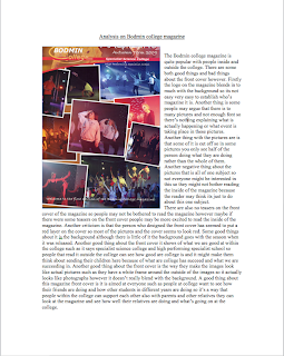
The next piece of work was to analysis are own magazine and say what we thought was both good and bad about the cover. Again I looked at the connotations to help write a fair analysis of the front cover of the magazine and to help me think of what I should do to make people want to read my magazine and how to make it stand out more to the readers.
I agree with a lot of what you are saying here Dan. The product is rather confusing and assumes that the reader will read it regardless of the teasers, puffs etc. I think the red tint is supposed to connote an autumnal theme.
ReplyDelete