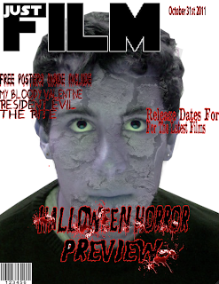
This is when my film magazine was only have complete but basically what I have done so far is got a picture of who the male passenger on the train was and then by using special affects on photoshop I managed to change his eye colour. I also looked at contact lenses on google images and but them on but they didn't look as effective so i decided to leave it like it is.
I have already talked about how I come up about my title back along on my blog so I don't feel I have to explain much more like I said I think it looks really effective the way in which I have done it although I had to play around with it a lot to get it the way I wanted to get it.
I decided to call this issue of the magazine the horror preview the reason for this is because my film is going to be a horror film and thats when all of the horror films are usually known for coming out although sometimes there are some exceptions one example of this would be scream 4 which is coming out soon and not in October.
I think the font that I have used on the front cover of my film magazine looks good I think the black font stands out good on the page and the red around it connotes blood which you usually see in horror films and I hope by using this technique that it comes across to my target audience better.
Like I said my film magazine is almost complete however there is no background so I decided to come up with this:
With my film being called the railway children and zombies I decided the perfect thing to have in the background of my film magazine would be a train. Now I believe that my target audience will understand what my film trailer is about. It also meant that I didn't have to do a lot of changing to it either I just had to rearrange the font a bit to make it stand out better the reason for this is because the train was black so some of the font you couldn't really see.
However I did change the font to white to see what it looked like and see whether or not it stood out better this is what it looked like:
I only changed a couple of the texts and decided that I didn't really liked it, although the font stood out a bit better I didn't feel as if it was quite as effective so I decided to leave the font black with a red outline.


No comments:
Post a Comment