
After thinking about what kind of music magazine I wanted to do I came up with a flat plan (above) and now I have came up with the final version of my front cover of my music magazine. I think that it has turned out well seeming as I had difficulties with trying to get the layout and everything right so i took a lot of time for me to get that right and another thing that took a little while was finding out were to put the writing so I could put a couple of images in.

I think my title is appropriate for the type of music magazine I am doing and I think it will stand out to the readers because the font colours stand out on the background and its also in bold so I think its appealing to the readers. A thing that took me a little while to think about was a catchy slogan because I wanted people to be hooked by it but after a few minutes of thinking I thought of one and I liked it so I added it.
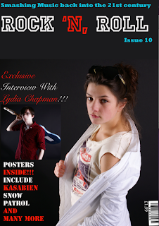
The easiest part I felt was putting the images on and adding effects to the images such as with the image of the boy holding the guitar I used a glow effect and I think it looks really effective because the glow comes off the guitar which I think looks good. I also had to crop the picture with the boy so it fitted in between the two bits of writing. With the image of the girl I made it bigger so it stands out as my main image but apart from that I didn't have to do anything to the image because I felt the image looked fine.
It also took me a bit of time to find the font but now I'm finally happy with the different fonts I have used because I think it looks effective and definitely stands out to the reader such as I like how the teaser about the posters stand out.
I'm happy with the colours I have used for the font because I think it stands out a lot on the background that I have chosen and every bit of font is in a different font so it isn't boring and I think it looks a lot more interesting than just one font.

I have decided to put the barcode in the bottom left hand corner because I felt having it up the top next to the title would make it stand out more when I didn't really want it to I also forgot to put a price on my first front cover but on the one above it does have a price.
Overall I think my front cover of my music magazine looks good and I have improved a lot since I done my front cover of the school magazine because I feel I have got a lot better at using photoshop. I'm also happy with the way that the images have come out after a bit of editing and I think the magazine will definitely appeal to readers that are into rock music.
Dan, this is looking much better than when I looked at it during class on Monday you have obviously been working hard! The title font now looks like it belongs on the cover of a magazine from the rock genre. However, I think there are still a few things that you need to address: a) where is the price? b) are you sure that the barcode and issue number work in the position they are currently in? c) are you sure the positioning of you main central image (which is very good by the way) is correct?
ReplyDelete