Monday, 19 April 2010

My double page spread


The final bit for my music magazine was my double page spread. The first thing I done was my flat plan so I had a rough idea on how I wanted my double page spread to look like.

I'm also very happy with how this piece of work turned out this time I decided to have a few more images on my double page spread but I think it looks good because there isn't to many pictures I think I got the balance right between the amount of font and the amount of pictures so I feel I get the combination right.

I decided to use white on black background because it stands out well and its the kind of colours that they would use in a rock magazine and I feel it stands out well and the readers will be able to clearly read about the interview I have done.

I think the hardest thing about my double page spread is trying to get the writing in the right place to make it look like a proper music magazine and deciding were too put the images because I wanted the story to flow so I decided to have the pictures in the top and bottom corners and opposite way round on the other side of the page so it looks neat and tidy. I have also decide on the other page to tilt the images slightly so it adds more of an effect when the reader reads the article. Finally I decided to add a background image on each page so that the double page spread doesn't look to boring instead there is a lot of colour so it stands out more.


Overall I am very happy with the work I had to produced and I have learnt a lot more skills with using photoshop which I am very happy about because now I feel I can create better pieces of work and I can get work done a lot quicker and at a better quality.


Contents page


Next thing I done for my music magazine was my contents page which didn't take me very long at all because now I'm a lot more confident with using photoshop the only problem I had really was finding the right colours to go on the background. As you can see my contents page is completely different to how I flat planned it but I decided to try something different.

Again I chose to have a main image then a smaller image in the bottom corner. I done the contents page different to most music magazines and I think it looks good and I'm happy with how it turned out although I know it doesn't follow the conventions but I decided that i wanted to do something different to see how it looks I see what kind of feedback I get back off people.

I had to have two different font colours because I started doing the font in white put then realised that I was going to go on the white on the background so again I done something different with using two different colours so the colours stood out on the background. Again i used three different colours and two different fonts such as contents page is in bold whereas the font for the contents page is regular so it doesn't look all the same.

I had to do a bit to the images but this time I decided to not add effects instead I just cropped the picture of the boy and made the picture of the girl bigger so it fits in as my background so it turned out really well.

I think that my contents page turned out well I didn't want to put too many pictures on the contents page because I felt it would look to busy so I think the way I done it turned out well and I'm happy with the way it now looks compared to the one for my school magazine because I have learnt more skills with photoshop.


Front cover of music magazine


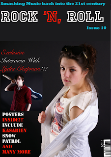
After thinking about what kind of music magazine I wanted to do I came up with a flat plan (above) and now I have came up with the final version of my front cover of my music magazine. I think that it has turned out well seeming as I had difficulties with trying to get the layout and everything right so i took a lot of time for me to get that right and another thing that took a little while was finding out were to put the writing so I could put a couple of images in.


I think my title is appropriate for the type of music magazine I am doing and I think it will stand out to the readers because the font colours stand out on the background and its also in bold so I think its appealing to the readers. A thing that took me a little while to think about was a catchy slogan because I wanted people to be hooked by it but after a few minutes of thinking I thought of one and I liked it so I added it.


The easiest part I felt was putting the images on and adding effects to the images such as with the image of the boy holding the guitar I used a glow effect and I think it looks really effective because the glow comes off the guitar which I think looks good. I also had to crop the picture with the boy so it fitted in between the two bits of writing. With the image of the girl I made it bigger so it stands out as my main image but apart from that I didn't have to do anything to the image because I felt the image looked fine.

It also took me a bit of time to find the font but now I'm finally happy with the different fonts I have used because I think it looks effective and definitely stands out to the reader such as I like how the teaser about the posters stand out.

I'm happy with the colours I have used for the font because I think it stands out a lot on the background that I have chosen and every bit of font is in a different font so it isn't boring and I think it looks a lot more interesting than just one font.


I have decided to put the barcode in the bottom left hand corner because I felt having it up the top next to the title would make it stand out more when I didn't really want it to I also forgot to put a price on my first front cover but on the one above it does have a price.

Overall I think my front cover of my music magazine looks good and I have improved a lot since I done my front cover of the school magazine because I feel I have got a lot better at using photoshop. I'm also happy with the way that the images have come out after a bit of editing and I think the magazine will definitely appeal to readers that are into rock music.

Photographs for front cover of music magazine

The next section for main task was to take photographs of people to use for my front cover, contents page and double page spread of my music magazine. This was the most challenging bit I found for the coursework because I have never really used a camera so I found it a challenge taking good photos so I have to do some work on photoshop to make them look good.

Here are some of the pictures I took:

I took this shot at mid shot and I think it looks really effective and I managed to take this photo well because the girl is in the middle of the shot. The clothes she is wearing is really relevant as well because she looks like a Rocker.


For this photo the girl turned around and done a Rock pose I think this is effective and different because you don't see a lot of people on music magazines with their back turned so I thought I would do it because its something different.


In this shot I decided to give the girl a prop and I took a longer shot than any of the previous one's because I wanted to make sure I had a number of different shots so I can show that I am able to do this I think with using props it looks better as well because there's more in the photo.


For this photo i decided to take a close up of the prop itself although there are hands on it because its something different I thought it would be a good picture to take and this was another photo I managed to take quite well I feel.


There was a few reasons why I choose this boy to be in my photo shoot firstly because I didn't want to be gender bias because then I wouldn't be advertising my magazine to a very big target audience if I was just aiming it at one gender and secondly again his dress code is very Rocky so i thought it would be perfect for him to be in it.

Survey monkey results

I thought the best way to get results from members of the public would be to create a questionnaire online so everyone can look at it. I also put the link on my Facebook account so all my friends and family could also look at the questionnaire I designed so they could give me feedback and an idea what different genre's people are interested the bands and artists they like and the price people would pay to buy music magazines thats if they are interested in them. I'm a bit disappointed because not many people answered my questionnaire despite me linking it on my Facebook so i will just have to analysis the results I did get from the people that answered it.
My first question was are you male or female?
The reason why I asked this is just because I wanted to see how many males to females have answered this questionnaire because males might have different taste in music to females and females might rather spend more money on magazines so I asked this question to see an overview on the questionnaire.


My second question was what music genre do you like?
I asked this question was because I wanted to see what music genres people like becaus
e it would give me a better understanding on what kind of music people would like to read about and it would grab the readers attention more if I done something on a genre people like rather then something they didn't like such as heavy metal music.


My third question was do you buy music magazines?
Te reason why I asked this question was because I wanted to know how many people actually are interested in music magazines as my results show a very small percentage of people buy music magazines so when it comes to making my music magazine I want it to be really
interesting so readers want to buy my magazine.


My fourth question was how often do you buy music magazines?
I asked this question because I wanted to know from the small percentage of people that buy music magazines how often they actually buy them again it was disappointing because the people that said they do buy music magazines only buy them occasionally so i want to make a music magazine that will want to make readers buy my magazine each time there is a new issue.


My fifth question was what kind of music magazine do you buy or would you buy if you had to?
I asked this question because I wanted to know what kind of music magazines people like to buy and read about because then I have a good idea on what to make my music magazine about. The favourites was Kerrang and NME so I have decided that I'm going to do a Rock Magazine.

My sixth question was how much are you willing to pay for a music magazine?
I asked this question because when I make my magazine I want to charge my music magazine at a price people are willing to spend and be happy rather then be unhappy because of the amount they have to spend on a magazine.


My seventh question was would you or have you subscribed for a music magazine?
This was just a general question really to see how many people have subscribed for magazines in the past because if they did then they must be really interested in reading music magazines however none of the people that answered my survey has ever subscribed for a magazine.

My last question was what Artist/band do you like to read about?
I asked this question because I wanted to know who people like to read about in music magazines and who there favourite Artist or Band is because then again it shows me the music genre that they are interested in.

In conclusion to this I have learnt a number of things in order for my music magazine to be successful firstly the type of magazine that I am going to do is a rock magazine. Secondly its not going to be to expensive because I want readers to buy my magazine and enjoy and for them not to feel that the magazine is over priced. Finally I'm going to have to think of a way to get readers to buy my magazine because the judging from the feedback that I have got there are not a lot of people that buy music magazines.